
.webp)
AVA Branding Guidelines
Unified standards for product, marketing, and development teams.
Layout & Grids
AVA layout system is built on a flexible 12-column grid, ensuring consistent spacing, alignment, and structure across all screen sizes. This framework supports responsive design from desktop to mobile, allowing seamless content adaptation without sacrificing usability.
Website

Tablet
.png)
Mobile
Logo
SaaSGrid's logo embodies a convergence of chart lines seamlessly shaping the letter S, symbolizing the harmonious blend of grids and data.
Logo Mark
Full Logo
Please Don’t Do This

.png)
.png)
.png)
.png)
.png)
.png)
.png)
Colors
SaaSGrid’s color system uses a balanced primary and secondary palette to maintain visual consistency, brand recognition, and accessibility. Primary colors drive key actions and identity, while secondary tones support structure, variation, and depth—ensuring clarity, hierarchy, and a cohesive experience across all screens and user interactions.
Primary Colors
Typography
AVA typography system combines Neue Montreal and Inter Display to create a clear, modern, and accessible visual voice. Type styles are structured for consistency across headings, labels, and body text—ensuring seamless readability, strong hierarchy, and a clean interface across all platforms, screen sizes, and content types.
Sora is a geometric sans serif tuned for display, that is, large point sizes. It is an Open Source typeface to adorn the headlines and interfaces of Cal.com
Heading 1
Heading 2
Heading 3
Heading 4
Heading 5
Buttons
AVA buttons are designed for clarity, accessibility, and ease of interaction. They follow a consistent hierarchy—primary, secondary, and ghost styles—with defined states for hover, focus, and disabled. Button sizes and spacing align with the grid system to ensure visual balance and intuitive user flow across interfaces.
Icons
Icons in SaaSGrid enhance usability, guide user actions, and support visual clarity. They follow a minimal, line-based style to align with the brand’s clean aesthetic. Used consistently across UI components, they improve scalability without adding visual noise or complexity.
Icons Library


.png)
.png)
.png)
.png)
.png)
.png)
.png)
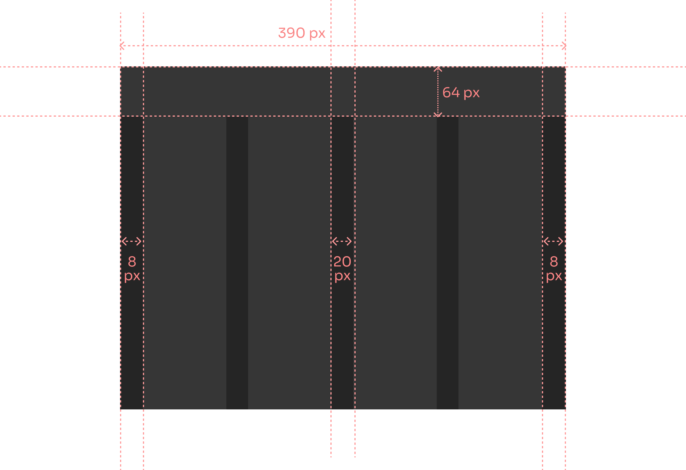
Spacing
AVA spacious layout ensures information is presented clearly, helping healthcare staff focus on what matters. With consistent spacing between form elements, users experience minimal cognitive load, reducing errors and speeding up intake. Clean margins guide the eye intuitively through the interface.
.png)
Overall Spacing


.avif)
.avif)